02 October 2025 (Editing Challenge)

This week members revealed what they had done with the four images that were circulated 3 weeks ago. The four images were:

  • A gyrocopter superimposed on a dark, cloudy sky with an artefact in the background.
  • A Chinese performer in a bright blue costume against a tilted background with distractions.
  • A back-lit lady standing in front of a church.
  • A man in Viking costume with a shield holding a ferret against a building with brightly coloured distractions.

15 members had accepted the challenge. The brief had been to edit any two of the four images, but some members had tried all four. All the images were too dark, so a common correction was the brighten the images and adjust the contrast. The back-lighting had lost some of the detail in the lady’s hair, which could be recovered with a highlights correction. Dodging and burning tools could be used to lighten the eyes and faces of the people or to darken bright blobs in the background.

Members revealed the different ways they had dealt with the distractions in the background. The easiest option was the crop the image to remove the distractions altogether, even if this meant losing most of the Viking man’s shield, for example. Some had used the clone and healing tools to replace distractions, and others had kept them in but made them less distracting by desaturating and darkening the background. There were mixed feelings about the hairs on the Viking man’s costume, which some members had removed as a distraction and others had emphasised as part of his character. The work on the Chinese man showed how you could spent ages removing two really obvious distractions but miss a smaller one that could be eventually pointed out by a judge. It’s worth taking a second look at your images after you have corrected them. However, the most creative way to remove distractions from a background is to replace it altogether. Kevin and Stephen had both replaced the boring grey sky behind the gyrocopter with a much more interesting sky, and Stephen and Jim had placed the Viking man in front of a much more attractive landscape.

Some members had combined the images in creative ways. Elaine combined the Chinese man and the lady into a single portrait, and Steven added the gyrocopter as a hair fascinator for the lady. Marian had converted the images into bold works of art, with a Pointillist rendering of the gyrocopter and a recreation of the Viking man in flowing brush strokes. But the comedy images were the highlight of the evening. Derek had converted the lady into a clown, Joe had given her a scary mask and Kevin had placed her inside a blossoming tree. Elaine had added the gyrocopter to the selfie taken at the Ayr air show. But the most entertaining images on the night came from Jim Innes, who not only managed to add the Viking man to some dramatic landscapes, had also shown him posing in front of an Iceland supermarket. The evening ended with Jim’s image of the gyrocopter being sprayed by fly killer! Thanks a lot to everyone who responded to the challenge.

  • Next Thursday, 9th October, we will be inviting Campbell Skinner to judge our Digital Projected Images competition.

13 October 2022 (DPI competition review)

This week we reviewed the feedback from last week’s Digital Projected Images competition and came up with the following hints and tips on how to improve the images and make the corrections suggested by Doug.

Quality Improvements: Some of the images contained noise, unnatural-looking halos and JPEG compression artefacts. Doug had speculated if these images had been taken on a mobile phone camera. Check the settings of your camera (looking for the gear wheel symbol on a mobile phone) and look for an “Image Quality” setting. If your camera has the option to save to RAW, switch this on. If the camera can only save to JPEG, change the quality setting to “High”, “Large” or “Fine”. If you see an “Image Compression” setting, change it to “off” or “minimum”. Also check the “Image Size” setting and make sure you are saving to the largest size possible. If you find a “Sharpening” setting, turn it off or reduce it to minimum, as the unnatural-looking halos can be caused by over-sharpening in the camera. Some mobile phone cameras have a “Pro” setting which allows you to change more settings when turned on. One of the poor quality images (a soft-focus view of the setting sun called “Pink Evening”) could be saved by reducing the clarity and blurring out the defects. That particular image worked because of the beautiful colours.

Cloning Improvements: Some images contained cloning artefacts, such as unnatural focus changes, duplicated objects or background areas laid on top of foreground objects.

  • Always apply cloning to your images at 100% magnification, so you can see the changes being made. If possible, clone your images in a duplicate layer, so you can erase mistakes.
  • If you are cloning around the edge of a foreground object, first make a selection around the edge of that object and then invert the selection. The selection will prevent your clone brush strokes accidentally replacing parts of the foreground object.
  • Look carefully when cloning and ensure you choose a clone source with the same level of focus as the area being replaced. Ensure there are no unnatural sharp-to-fuzzy boundaries.
  • Look carefully after cloning and look for duplicated objects. Clone these duplicated objects out a second time to remove the evidence of cloning.
  • Lastly, look for any mistakes you might have made during the cloning. Do the boundaries of all the objects still look normal? One of the competition images showing a cricket match looked odd because there was chunk missing from a wicket, showing where the photographer had used Photoshop to move one of the bales. Clone the wicket again to hide that mistake.

Better Composition: Some images were technically good but lost out because of poor composition. The best way to improve your composition is to view the works of other successful photographers, especially those entered for exhibitions and salons. For example, the Edinburgh International Exhibition of Photography 2022, the Dingwall National Exhibition, or the SPF Digital Championship. You can also “Google” for images of specific subjects you are interested in (e.g. “Images of wellington boot plant pots“) and see how some of the stock photos are composed. You will notice the most striking compositions tend to be the simplest, where the subject stands out from the background and isn’t competing with other distractions. Best of luck.

Tonal Corrections: The simplest way to make tonal corrections is to use the “Exposure”, “Contrast”, “Highlights”, Shadows”, “Whites”, “Blacks” and “Clarity” sliders in Adobe Camera Raw. If someone suggests toning down the highlights, try moving the “Highlights” slider to the left. To brighten the shadows, move the “Shadows” slider to the right. To make an image more punchy you can try moving the “Clarity” setting to the right. The “Blacks” and “Whites” sliders can also be adjusted so the image fills the whole histogram. However, when David Clapp spoke to us in March 2022 he told us that he makes his landscape photographs look more natural by lowering the contrast and not including the blackest black or whitest white in his images. So whether the brightness and contrast looks right can be a matter of individual taste.

You can make more specific tonal corrections by using the dodge and burn tools in Adobe Photoshop. Select one of these tools and use it like a brush. Change the “Range” setting to select where you would like most of the changes to be made (highlights, midtones or shadows) and reduce the “Exposure” setting to a small value (15% or less). Using a low “Exposure” setting helps you build up the effect gradually by brushing over the area that needs correcting. The “Burn” tool was used to darken the highlights in the background of one of the portraits without darkening the face.

  • The “Dodge” tool, which looks like a black wand, can be used to lighten areas. Try Range=Shadows or Midtones.
  • The “Burn” tool, which looks like a white hand, can be use to darken areas. Try Range=Highlights or Midtones.
  • The “Sponge” tool, which (funnily enough) looks like a sponge, can be used to change the colour saturation of an area. More about this later.

Lastly, if you have an image that needs a lot of dodging and burning (lots of areas that are too dark or too light) and would lose its punchiness if you just reduced the contrast of the whole image, there is a Photoshop shortcut you can use to save a lot of work:

  1. Open your image in Photoshop and duplicate the background layer by pressing Control+J.
  2. Select the background layer and desaturate it with Image/Adjustments/Desaturate, or by pressing Shift+Control+U.
  3. Now invert the background layer with Image/Adjustments/Invert or by pressing Control+I. You will see a black and white negative version of your original image.
  4. Now blur this black and white layer with Filter/Blur/Gaussian Blur or Filter/Noise/Median (the “Median” option is better if you want to preserve sharp edges). The amount of blurring determines the overall look of your final image. More blurring will give you a more natural look in the end.
  5. Now change the blend mode of this black and layer to “Overlay”. Voilà! You will see an automatically flattened version of your original image. The result might not always work. If you don’t like the look, try changing the blending mode to “Soft Light” or go back the step 4 and change the amount of blurring.
  6. Once the image has been adjusted in this way, you can now increase the contrast without losing the shadow and highlight areas.

Colour Corrections: An image showing a train emerging from under a bridge had a blue colour cast in the smoke. You can check for colour casts in your images by using the “Colour Sampler” tool in Photoshop. It’s the one that looks like an eye dropper next to a crosswire. Click the colour sampler on an area that is supposed to be white or grey and check that the R, G and B values are about the same. If the values are different it suggests a colour cast. (This works even in that frustrating situation when you are colour blind and a judge can see colour casts you missed.) The first thing to try is correcting the colour cast by adjusting the colour balance. You can use the “Temperature” slider in Camera Raw or the “Colour Balance” adjustment tool in Photoshop. Try selecting more than one area that is supposed to be white or grey. If you can correct them all by changing the colour balance then the job is done. But if you are happy with the overall colour and want to remove a cast from just one area (the smoke in this case) you can use the “Sponge” tool mentioned above. Change the “Mode” to “Desaturate” and use a fairly high “Flow” setting.

Sharpness and Focus: We reviewed some of the images which had poor focus or sharpness. It is worth trying the Photoshop “Filter/Sharpen/Smart Sharpen” tool to sharpen your images one last time after reducing them to 1600×1200 pixels for the DPI competition. Set the “Radius” to 0.5 and move the “Amount” slider to recover the fine detail that is sometimes lost when reducing the image size. I tend to use “Amount” in the range 20-80.

It can be really difficult to get the depth of field and sharpness right in a macro image. Poor light, combined with a moving subject, might force you to use a wide aperture or high ISO. Adding more light with the aid of a diffused flash is one way to improve hand-held macro images. There are apps you can use to calculate the depth of field in macro shots: for example PhotoPills. Some members have also successfully used the Topaz Sharpen AI tool to recover detail and correct motion blur (as long as you check carefully for artefacts before accepting the changes it makes).

Thank you everyone who entered the competition. I hope you all got some useful feedback from the experience.

08 September 2022 (Introduction to Photography and Printing)

We had our second club night of the new season on Thursday, 8th September 2022, where Steven Beard, Joe Fowler and Charlie Briggs gave an introduction to photography and offered hints and tips to members. Gavin Marshall was the only member attending by Zoom.

The meeting began with Steven Beard giving a shortened version of his “Introduction to Photography” presentation. The presentation offered new members advice on composition, focus, exposure and colour. A PDF of the presentation is available on the club web site and may be downloaded by clicking the link below:

A much more detailed version of the presentation can be downloaded in several parts from this club web page:

Steven also gave members a brief introduction to the club competitions, which can be downloaded by clicking the link below:

Joe Fowler then showed members a series of images and explained why some shots worked and some didn’t. Joe explained that long exposure shots of rivers and waterfalls work better when the exposure time is just a few seconds or shorter, as longer exposures tend to burn out the water and remove detail. Shots of stunt riders (or birds) in the air worked better when there were fewer distractions in the background. Joe showed how he used the clone tool in Photoshop to remove the distractions. He had used this tool to construct a tight composition of boats at Fisherrow harbour or remove distractions from the edge of a shot of sea birds on Bass Rock. Joe finished with a motorbike racing shot which had won him “best image” at the Borders Digital Challenge. The image was constructed from 3 separate riders placed together using layers, with background distractions cloned out or blurred. Joe always take a shot of someone wearing a clear face visor so he can clone their eyes onto riders who insist on wearing black visors.

In our third presentation of the evening, Charlie Briggs explained how he prepares his images for printing. He begins with a calibrated monitor, so he is better able to judge the colours of his images. He also calibrates his printer and uses top quality printer paper. Charlie explained that the same image looks very different when shown on a screen or printed on paper. An image on screen is made by adding light to a dark background, but an image on paper is made by adding dark ink to a light background. An image which looks great on the screen will tend to look a bit dark and drab when printed. Charlie uses the following Photoshop tip to correct for the different.

  • Start with an image which looks good on the screen.
  • Open the image in Photoshop.
  • Click on the background layer and uses CTRL/J to duplicate the layer.
  • Select the duplicated layer and change the blending mode to “Screen”.
  • Adjust the opacity of the duplicated layer to around 20-25%.
  • Now print the image and see the difference.

Charlie showed members some example prints which showed how this method brightens the result and makes the prints punchier. This technique will be very useful for the Colour Print competition submission on 13th October 2022.

Here are some additional announcements since opening night:

  • Please don’t forget to contact Stephen Williams (sgpwilliams@outlook.com) to rejoin the club.
  • There is a PAGB award presentation this Sunday, 11th September at 1pm. Please email Steven Beard or Stephen Williams for the Zoom information if you would like to attend.
    Check here for details: http://www.thepagb.org.uk/awards/apm-awards/
    (NOTE: The Musselburgh Communities event was cancelled. I don’t know the latest status of this PAGB event.)
  • There is an astrophotography special Sky at Night being broadcast on Monday, 12th September at 10pm on BBC4. The program features some video images which I submitted to the BBC!
  • Our next meeting on September 15th is our first “Sets of Six” evening. Please bring along up to 6 images, or one video, to show club members. The night is also an opportunity to present a useful trick or technique (such as Charlie’s printing trick) that other members might find useful.
  • Please submit you 3 JPEG images for the Digital Projected Images competition to Geroge Todd (georgetodd1957@me.com) by 15th September.

I won’t make it to the next meeting, but I’ll see you all in 2 weeks for our first speaker of the season: George Robertson.

Steven

08 April 2021 (A Photoshop Retrospective)

This week we were delighted to welcome Libby Smith of Carluke Camera Club and the Scottish Photographic Federation.  Libby had last visited the club in 2018, only this time she didn’t need to trek from Carluke to Musselburgh in the foul weather. Libby’s talks are always fascinating and enlightening and usually contain valuable snippets of information about Photoshop techniques. This time Libby gave us a complete Photoshop perspective, describing how she first got into digital photography in the 1990s by scanning slides and film.  Photoshop began as a digital alternative to darkroom techniques. It could be used to correct the tones and colours from digitized slides, or combine slides together for special effects. Colour slides could be converted to black and white. Using Photoshop to add film grain noise to the digitized images helped lower the contrast and create an atmospheric effect. Libby learned that you can’t use the same effect on everything, and it pays to experiment and find which techniques work best for your own style of images. For example, a watercolour art effect can enhance some images by removing background detail, as long as the effect doesn’t destroy important detail in your subject. The “find edges” filter can also be used for special effects. A layer mask can be use to apply the effect only to certain parts of the image (e.g. to some tulips but not the sky behind them). You can experiment with different brush textures for creative effects. You can also change the mood by hand-colouring parts of your image.

Libby moved on to show us how she learned to make composite shots using Photoshop layers. Composites give you more creative freedom. You can take components from several different images (a lighthouse from one place, a clifftop from another place, a dramatic sky from somewhere else…) and combine them. Libby warned us that if you become well known for making composites, people will start to think every image you show is a composite! Dramatic images can be made by blending a portrait or still life image with a textured background. Libby makes textured backgrounds by photographing interesting objects (such as dried petals, plants, seed heads and feathers) against a plain white background. The white background helps you to select the objects. You can also capture images of flat objects using a flat-bed scanner. The backgrounds can be placed in separate layers and combined using “soft light”, “hard light” or “overlay” blending modes. These blending modes tend to add contrast, so it is important to reduce the contrast in the background before blending. Libby went on to show us some stunning landscape images, dramatic images of derelict cottages and mining equipment, and some beautiful portraits; all enhanced by Photoshop techniques.

During the evening we also learned the following hints and tips:

  • When using a digital camera with Photoshop, try to expose so the peak of your histogram moves as far to the right as possible without losing highlights. Unlike slide film, which is best exposed to give rich dark shadows, digital cameras give the best results when the shadows have as much light as possible.
  • Photographs tend to look darker when printed than when viewed on the screen. Libby lightens her images by half a stop before printing them.
  • The “magic wand” selection tool can be used to select a white background, enabling objects placed on that background to be selected without leaving a halo around them.
  • If you are applying special effects to a portrait, make sure the face is not affected.
  • Using a negative clarity setting in “camera raw” can create a soft focus effect (as an alternative to blurring).
  • Try removing just a subset of the colours from an image to create a black and white image with a little bit of colour. Libby often removes green to reduce the distracting effect of grass but keep the subtle colours of rocks and stones.
  • A colour print can sometimes be improved by boosting the saturation in yellow and red (using the “hue and saturation” adjustment), which will emphasise the light on the print. A sunset image can similarly be improved by reducing the saturation in the blue.

Libby was our final speaker of the season, but she gave us lots of creative ideas to try over the summer and take to next season. Thank you Libby for a very entertaining and fascinating talk.

Software and Licencing for Audio Visual Presentations

After the audio visual evening we discussed the software used to create audio visual presentations. I use Proshow Producer, which has now been replaced by Photopia (https://photopia.nl/proshow/), a subscription-based application. Beeslack recommended a utility called WNSoft PTE AV Studio 10 (https://www.wnsoft.com/en/pte-av-studio/), which can generate shows for Windows, Apple and Android devices.


Stephen Williams has also found the following free video creation applications for people interested in creating AV presentations and sends this message to members:

They are relatively intuitive, but they each have their pros and cons.  They are available as portable versions (PortableApps.com) which I prefer, or you can download installable versions directly from the provider’s websites.  Both of these struggled to work on my 7-year old AMD laptop (running Windows 10), but ran on my 2-year old i7 laptop (also running Windows 10).

OpenShot (https://www.openshot.org/)

Bright, intuitive interface (drag images, videos and audio files into the project file area, then drag down to the timeline, right click to add transitions and effects – see the quick user guide before you start at https://www.openshot.org/user-guide/).  I found that the software kept crashing, but it seemed to remember where it was when it reloaded.  However, maybe I was just trying to push it too hard.  I was unable to access the Preferences menu where I might have been able tweak the settings to stop this happening – I don’t know why, this may just be a bug with the current version.  Others might have more luck.

Shotcut (https://shotcut.org/)

This has a more cluttered interface on first opening, but ultimately the process is more or less the same as OpenShot.  Check out the short video on how to use it at https://www.youtube.com/watch?v=JtsB2iZRb9c&feature=emb_logo – this is essential even just to get going.  Adding effects are a bit more fiddly – you need to create Keyframes and how you want the image to look at both the start and end of the effect period and the software then interpolates, but ultimately this is more flexible than OpenShot.  Transitions between slides were easier to implement, but the options were more limited than OpenShot (but there are only so many garish transitions that you can tolerate anyway).  One other nice thing was that once you reopened a saved project and added more slides to the end of the timeline, as long as the original audio track was long enough it filled in the gap – with OpenShot you were left with blank audio and would need to reimport the original longer audio track.  Crucially for me the software was stable, not crashing during use.  So although it took longer to learn how to what I wanted it to do, this was the better choice for me.


Finally, Beeslack member John Barnett has drawn our attention to the website of the IAC Film and Video Institute (https://www.theiac.org.uk/),  where you can find advice and purchase an audio dubbing licence for video presentations.


Making Audio Visual Presentations

There is an audio visual evening with Beeslack scheduled for 4th February 2021. Last week I was asked about software for creating audio visual presentations from photographs. Microsoft Powerpoint can be used to make a presentation, but it can be tedious to use. I gave an introduction to audio visual presentations back in 2018, which you can find by clicking this link.

https://musselburghcameraclub.org.uk/2018/11/26/22-november-2018-introduction-to-audio-visual-presentations/

At the time, the recommended software to use was Photodex ProShow Gold, which was available for Windows only.  There was a Mac alternative called “Photo Theatre Pro” (which may or may not still be available in the Mac store). Sadly, Photodex Proshow is no longer available and has been replaced by “Photopia”.  The good news is the new software now works with both Windows and Mac. It has a subscription-based licence, so you could subscribe only when you need to make a show. Click the link below for more information.

http://photopia.nl/proshow/

However, if you have Windows 10, the free Microsoft Photos program also contains some of the basic elements that Proshow Gold used to have. You can combine images into a slideshow or video, add a title slide, add captions and add background music. I think this is now a better option than Powerpoint for Windows users. You can start the program by selecting the images you want to show, clicking with the right mouse button and selecting the “Create a new video” option shown in the menu.

When the program starts you will see a screen like this (which looks remarkably similar to the Proshow screen). You can drag photos from the library window on the left onto the timeline at the bottom and view your show using the preview window on the right.

I hope this helps. Have fun, whichever tool you use.


Shots of the Pink Supermoon

Malcolm Roberts would like to draw members’ attention to this tweet showing a photograph of the recent “Pink Supermoon”. Malcolm asked how to create a “10 shot stack”. You can read a tutorial on the subject by clicking on the link below.

Astrophotography Tutorial: Image Stacking in Photoshop


31 January 2019 (How Did You Do That)

This week members shared their image processing hints and tips, revealed how to make some special effects or brought in questions to be answered. Here are some highlights from the discussion.

Removing unwanted objects.

Quiet often an image will lose marks because of a distraction in the background or a bright spot near the edge. The easiest way to remove the distractions is to crop the image, but what if you can’t? If cropping the image would remove something important, the other way to remove distractions is to used the “patch”, “clone stamp” and “healing brush” tools in Photoshop. The patch tool is great for removing distracting objects against a plain background (such as sky, grass or water). Look for the tool that looks like a sewn patch as shown here.

Make a selection around the object you want to remove, click in the middle and drag the patch somewhere else in the plain background. When you release the mouse the object will be removed. If your background has a pattern, such as waves or stripes, line up the pattern as best you can before releasing the mouse. Hint: You can remove a large or oddly-shaped area by patching it a bit at a time.

The clone stamp tool can be used for trickier patching jobs, like the image below. Select the tool looking like an ink stamp. Move the tool to an area you would like to copy and click while pressing the ALT key. Then move the tool to the place you would like to erase, line up the edges and start painting.

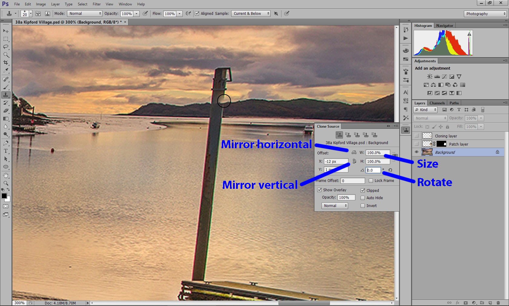
The “clone source” window (above) can help you to match the edges. If you are copying the top of the mountain but it is at the wrong angle, try changing the rotation. If you are cloning a background with a gradient, use the “Mirror horizontal” button to flip the gradient so your painted strokes don’t leave a sharp edge. Here are some more cloning hints:

  • After cloning, go over the same area with the healing brush to smooth over the edges and remove artefacts. Look for discontinuities and unnatural straight edges.
  • Try to clone from many different sources to avoid creating repeating patterns. When you have finished, look for duplicated objects and similar patterns and change the duplicates by passing the healing brush over them.

Local Tone Corrections

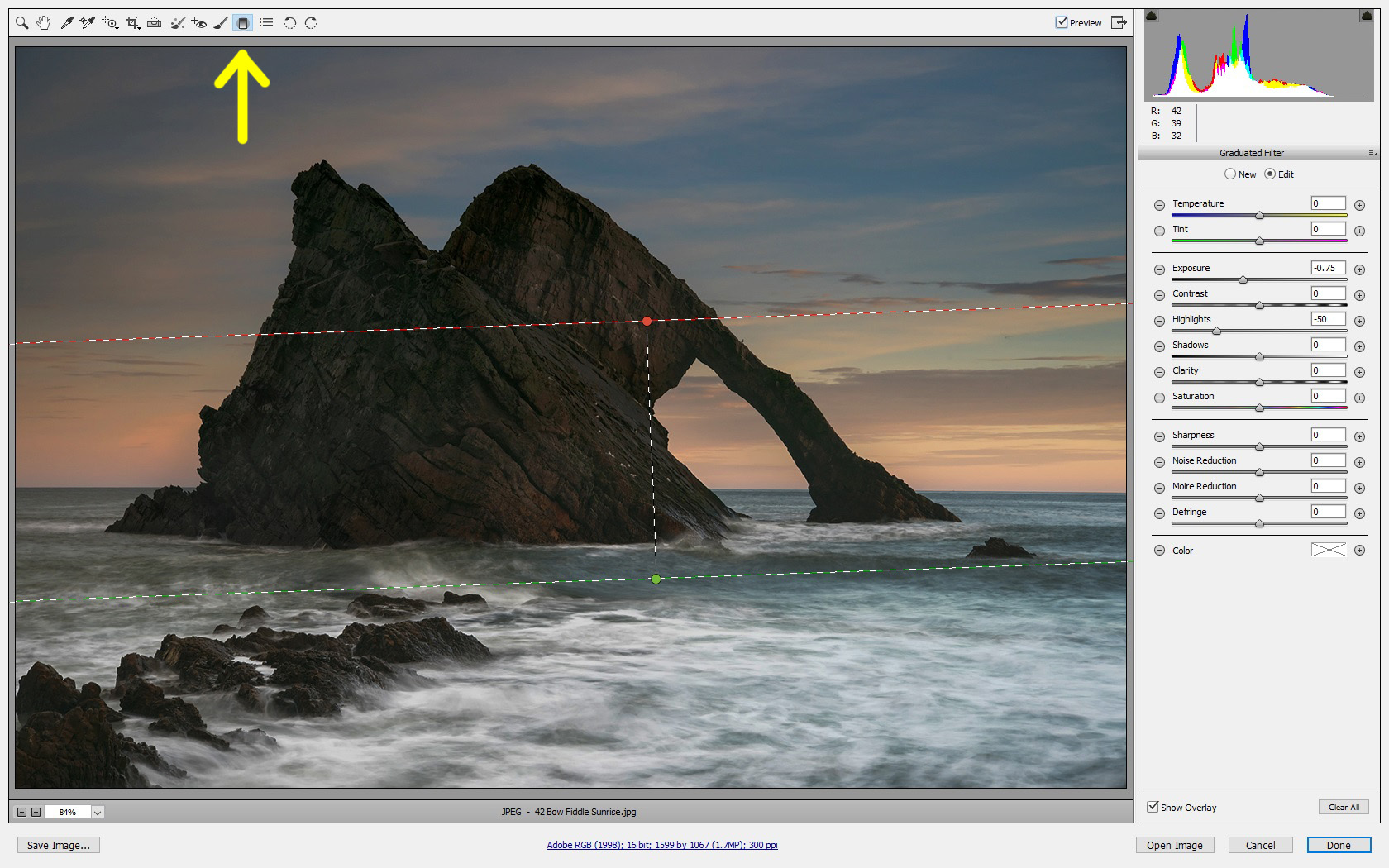
We have all been told to use the “brightness”, “levels” or “curves” tools in Photoshop to adjust the brightness and contrast, but what if your image only needs a partial correction? “camera raw” comes with a selection of very useful adjustment tools. The first is the “gradient tool”, shown below. First select the adjustment you would like to make (in this case a reduction in exposure and darkening the highlights) and then sweep with the mouse away from the part you would like adjusted (in this image from bottom to top). The adjustment darkens the foreground highlights.

The second is the “adjustment brush” shown below. This tool uses exactly the same sliders as the gradient tool, only this time you can paint the adjustment anywhere on the image. Ticking the “auto mask” box prevents the adjustment accidentally leaking across a sharp edge. Hovering the mouse over the point reveals which parts of the image have been painted over (as shown below in red).

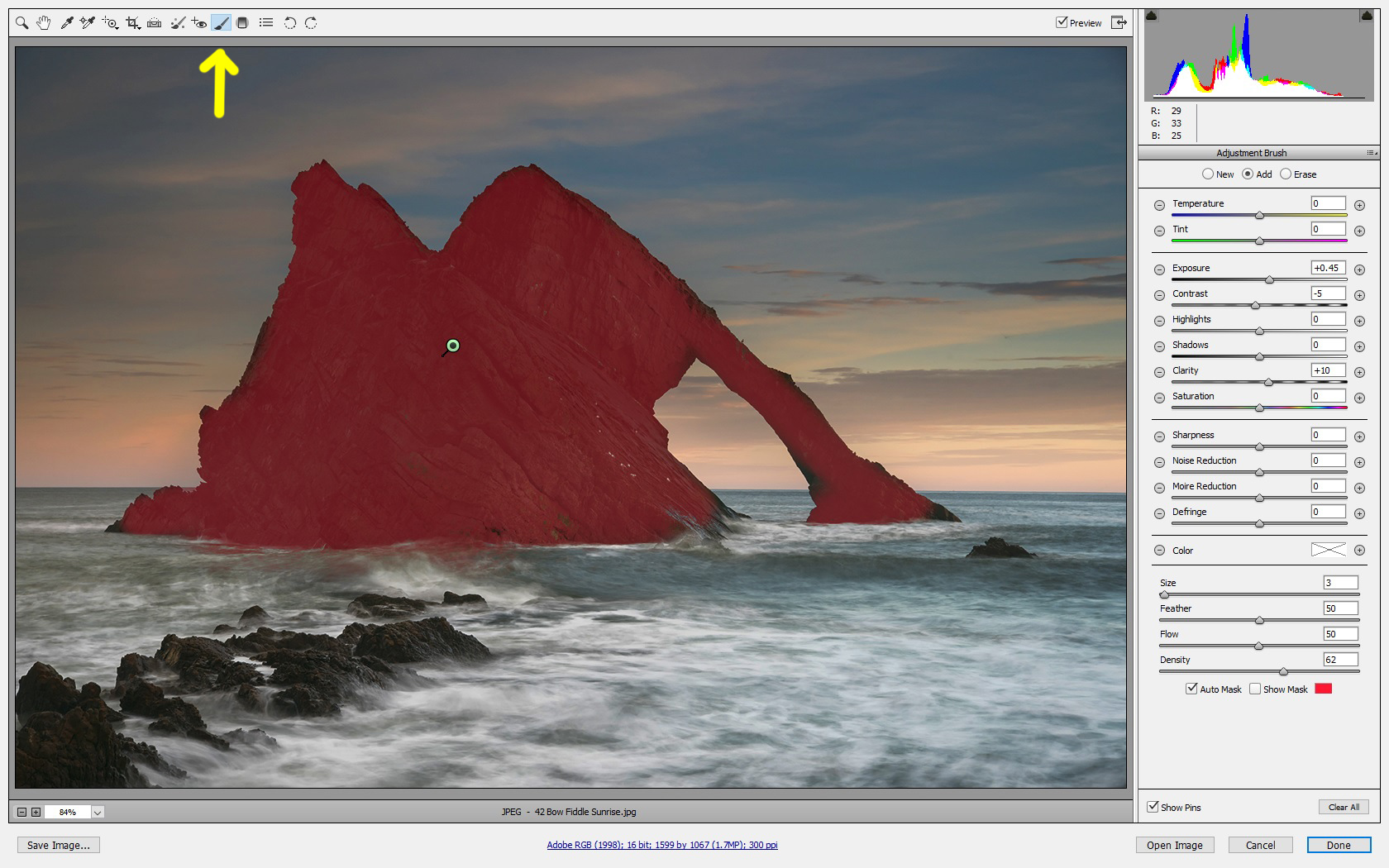
This adjustment is particularly useful for brightening the faces in a portrait or for darkening bright distractions near the edge of an image. The secret is to make only small adjustments so your image still looks natural. You can change the adjustment at any time.

Content Aware Scale

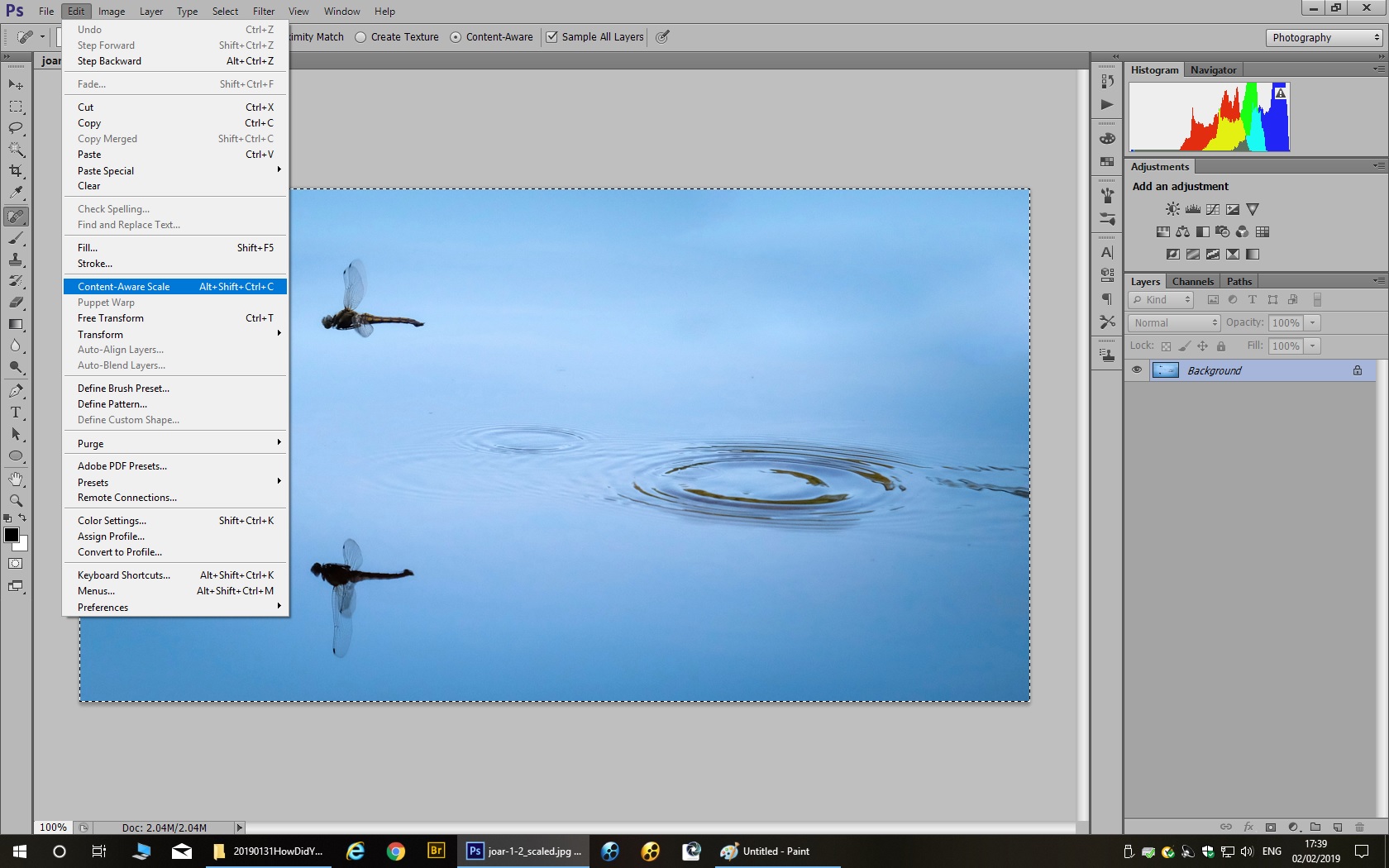
The content aware scale is a little used Photoshop utility (which has been available since CS4)  but its results can be absolutely magic. It is ideal for compositions with several subjects spaced out against a plain background. If you would like to bring the subjects closer together, or to change the aspect ratio of the image without cropping it, a content aware scale may work for you. First select the part of the image you would like to scale with a rectangular box (or use “select all”). Then select “Edit/Content Aware Scale” as shown below.

Now move the edges of your image inwards and watch the magic happen. Look carefully and make sure non of the main subjects are compressed by the effect. The vacated parts will be filled with background colour, but you can remove them with a crop.

Correcting Horizontals and Verticals

One member asked how to correct an image where the main subject is tilted at a strange angle. There are alternative two ways of doing this. The first and simplest method is to rotate the image and crop it. This method is best used for an image, such as a seascape, where the horizon is tilted or an image, like the one below, where an object which should be vertical (the church tower) is leaning to one side.

The example shows the crop tool in “camera raw”. Right-click on the image and ensure that “Show overlay” is ticked. Move the mouse outside the crop area and drag the edges to rotate the crop until the overlaid lines match up with the horizontals and verticals in the image.

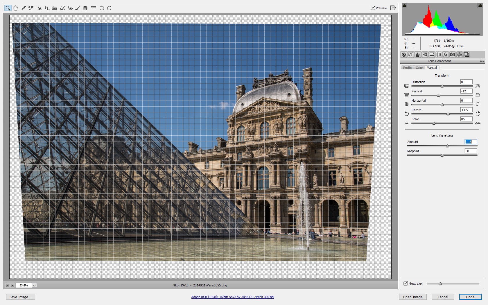
If your image is more complicated, such as an architectural shot, the second method is to use the lens correction filter, as shown below. The “camera raw” lens correction filter is easier to use. Click on the tool which looks like a lens schematic “()()”. The “rotate” slider rotates the image, just as before. Use this slider to line up the horizontals and verticals in the centre of the image. The “vertical” and “horizontal” sliders can be used to correct the horizontals and verticals at the edge of your image. (The “distortion” slider can be used to straighten lines if your shot is taken with a wide angle lens.)

The lens correction filter in Photoshop itself has the same controls, but the “rotate” control is very fiddly to use.

After using the lens correction filter you will need to crop the image. If the sloping edges mean you lose something important outside the crop, it is possible to crop slightly outside the boundary and use a “Content Aware Fill” (available from CS6 onwards) to fill the missing parts. You should treat this fill like a clone and repair any odd-looking artefacts with the healing brush.

Don’t Make The Mistake I Made

Here is an image showing a mistake I made when creating a black and white image. The black and white conversion tool in Photoshop can be used to convert a colour image to black and white. The tool lets you adjust the colour sliders, or apply one of a number of presets, until you get the effect you want. Sometimes you will find different conversions work better in different parts of the scene. In the image below I applied two different black and white conversions to the bottom and the top of the image.

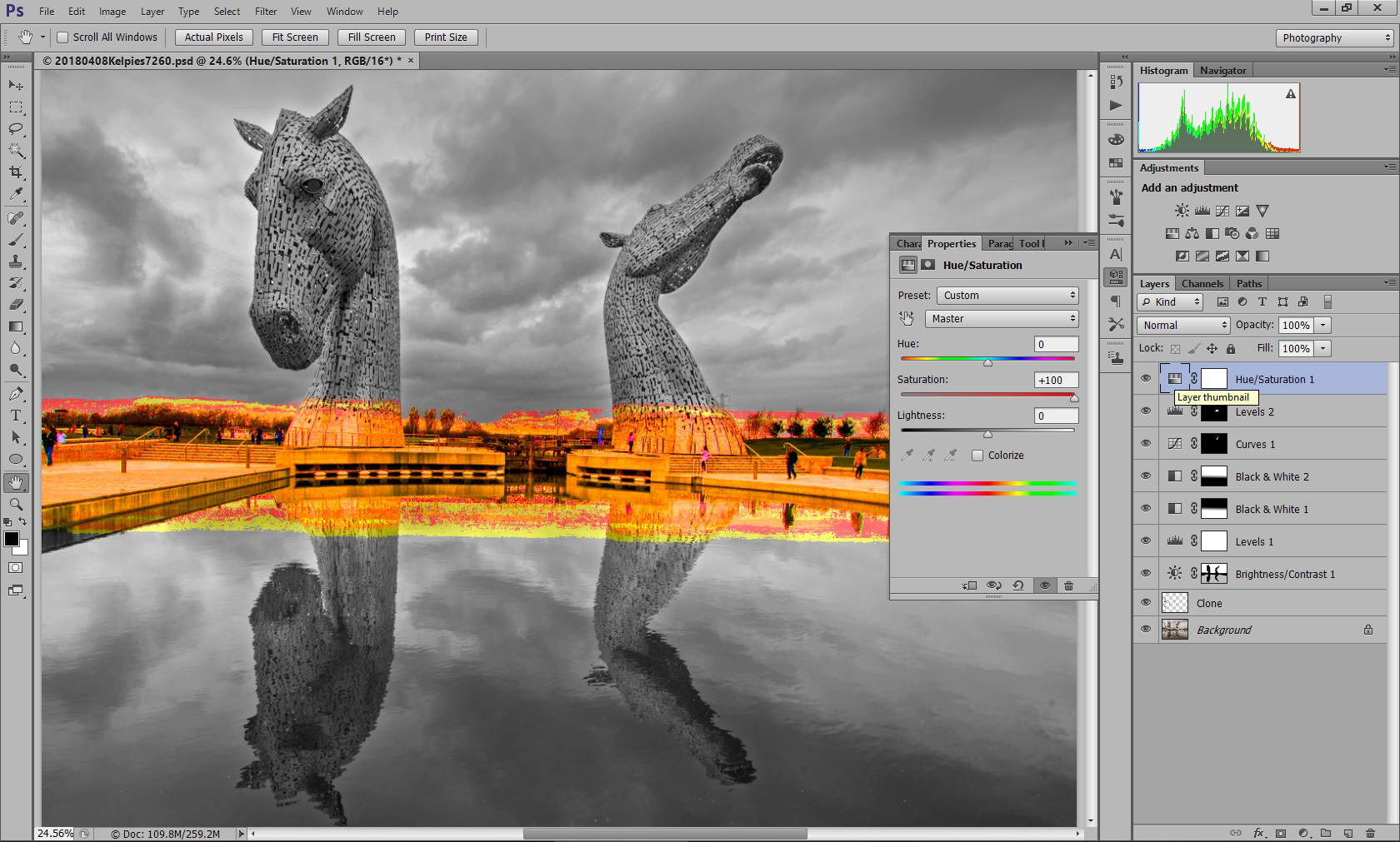
The mistake I made? The opacities of the two conversion layers don’t add up to 100%! Right in the middle there is a patch which looks black and white but actually has a tiny hint of colour. The mistake is revealed by boosting the saturation. To ensure you never make this mistake, always add a black and white conversion or desaturation layer which acts on the whole image.

Solarization Effect

Finally, here is a special effect you can try on an image with boring highlights, such as a blank and uninteresting sky. Applying a curves adjustment in the shape of an upside down “U” will create a solarization effect in which the dark parts of the image are shown in positive and the lighter parts are shown in negative.

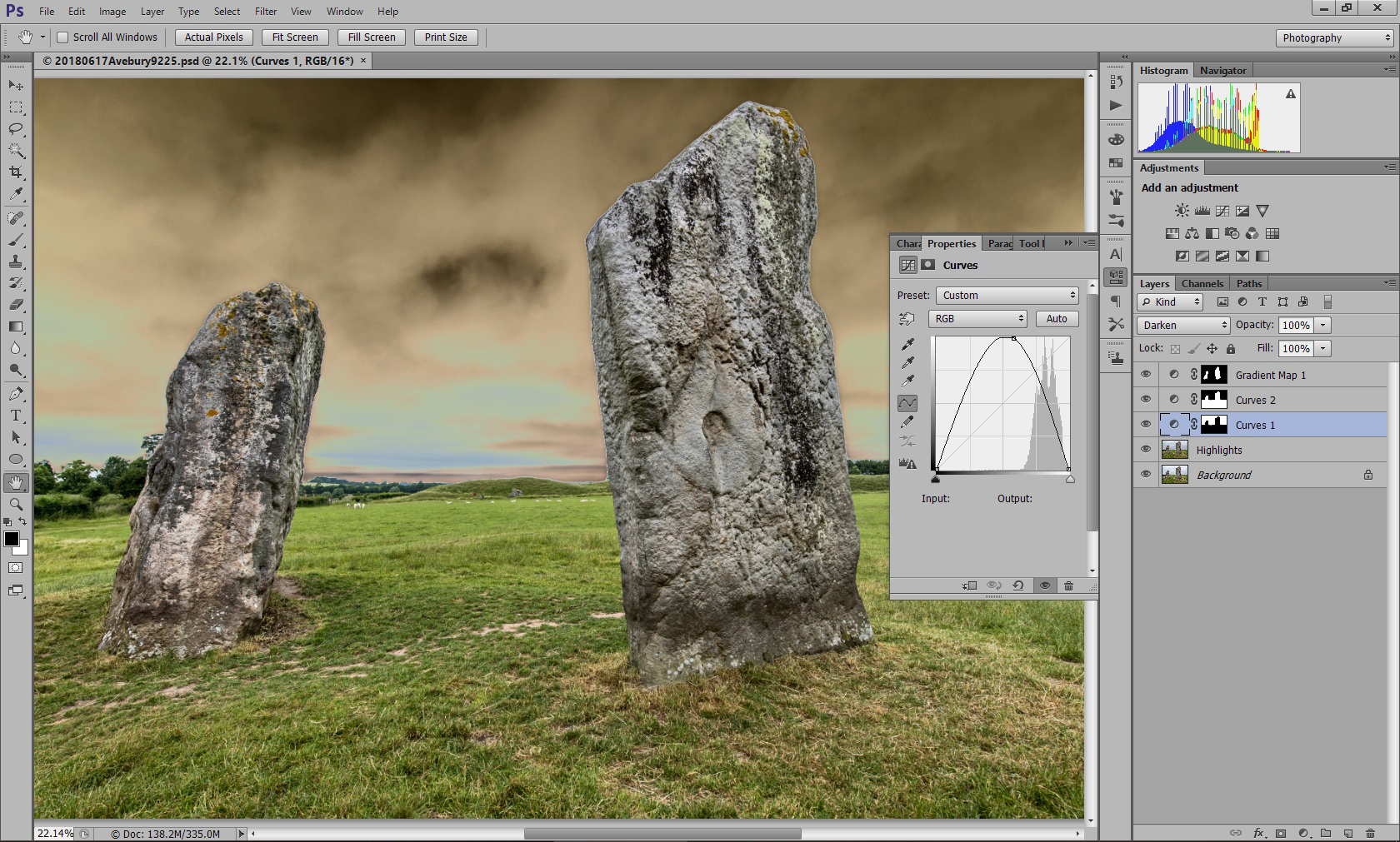
You can vary the effect by dragging the top of the curve left or right, and you can use a layer mask to confine the effect to just part of your image. For example, the mask in the above image prevents the effect changing the white parts of the stones.

I hope these hints and tips will help members to adjust their images or have some fun with the special effects.


22 November 2018 (Introduction to Audio-Visual Presentations)

On Thursday, 22nd November I gave club members an introduction to making audio-visual presentations. Audio-Visual presentations are another way to show your work, in addition to prints and digital projected images. Click on the following link to download the notes from my presentation.

MCCIntroductionToAudioVisualsNotes

You can create a slide show with captions, animation and basic sound effects using PowerPoint. Clive Davies showed us how PowerPoint can be used to present a large number of images within a surprisingly small file size. The image compression is sufficiently good that the image quality on screen looks just as good as the original.

To make a full audio-visual presentation you will need extra software. The club recommends Photodex ProShow for Windows PC users. You can download a trial copy from http://www.photodex.com/proshow. Mac users can try Boniten Photo Theatre Pro, which is a similar product.

The evening finished with some example audio-visual presentations. Gus Langlands showed us one of the first presentations he and John Knox had put together, taking the viewer on a tour of the sites around East Lothian. The images for that presentation were scanned from slides. Gus and John create their sound track using Magix Sound Forge audio editing software, which can edit a sound track in the same way that Photoshop can edit an image. Unwanted clicks and pops can be “healed” out.

This coming Thursday, 29th November we have a knockout competition on the theme of “transparency” (i.e. subjects which are transparent or evoke the theme of transparency, not slides). Please bring along 1, 2 or 3 JPEG images on the night. If you can’t be present please email your images to George Todd. Members will vote for their favourite images on the night, and the best image will win a prize!


Adobe Giveaway

If there’s anyone been considering buying Adobe Photoshop but didn’t know if it was for you or not Adobe are giving away some of their older versions of some of their products and they are available for download here

http://www.adobe.com/downloads/cs2_downloads/index.html – remember to copy the serial numbers as well because they will still need activated on install.

The fact they are giving them away means they are probably no longer going to recieve any updates etc but will give a novice a good feel for the product before deciding if it’s something they could use.

The big download is CS2, it’s got three files so i’m not entirely sure if it’s the extended version or not. For those not familiar the current version is 6.0

There’s also Photoshop Elements 4/5 (current version 10 or 11?) so that gives you an idea that they are older versions but hopefully of some use to some of the members.

There’s also some other products going free on that link as well.

Having downloaded one or two of the versions for another PC I’d advise that they are more suited to non Windows 7 pc/laptops, if you do use Windows 7 be aware when you open one of the older programmes they change your coulour settings while the programme is open but change it back once you close it.